- Product News
Exploring Colourful Kitchens
- What are the evolving kitchen colour trends in 2025?
- What are the key factors that are influencing the shift towards these trends?
- Why are homeowners increasingly confident in incorporating colour into their kitchens?
- What practical guidance would you offer designers when specifying colour-rich kitchen schemes?

As kitchen design continues to evolve, colour is stepping into the spotlight. The era of stark minimalism and cool greys is fading fast. In this feature, Uform’s Category Manager Sara Cotter explores the industry’s colour revival and what it means for both designers and homeowners seeking kitchens that reflect today’s lifestyle priorities: sustainability, longevity and self-expression.
What are the evolving kitchen colour trends in 2025?
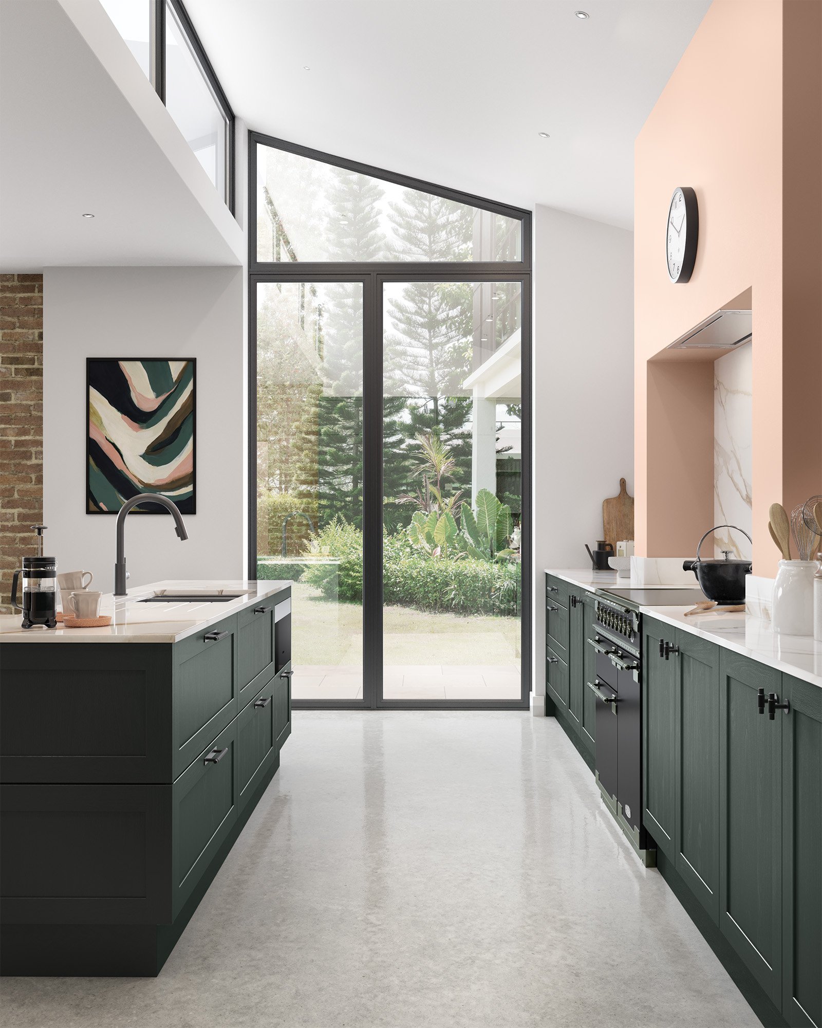
In 2025, kitchen colour trends have shifted towards warmer, nature-inspired tones that reflect a broader move away from cooler greys and stark minimalism. Earthy neutrals such as taupes, greens, and mushrooms have gained traction, offering a softer, more inviting aesthetic.
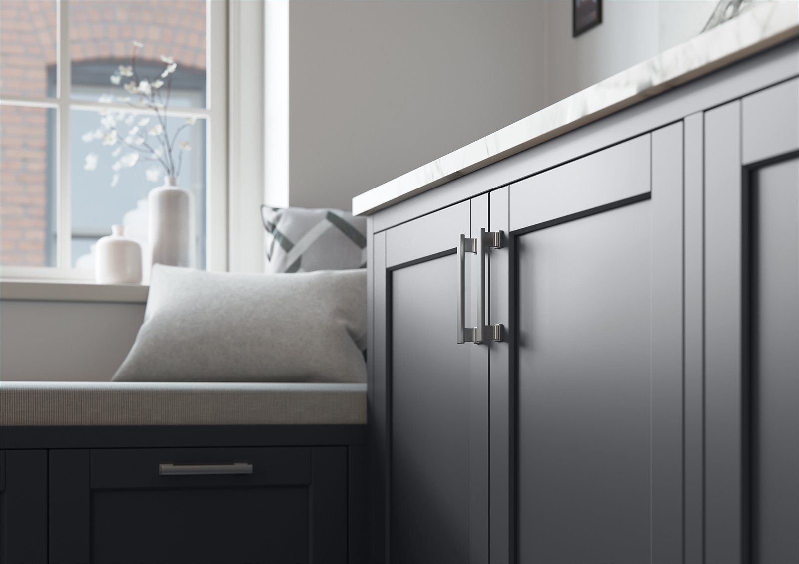
Stained woods in washed or deep brown finishes are gaining popularity in premium slab and shaker kitchens. These tones highlight natural grain while adding a refined, modern edge. Whether soft and sun-washed or rich and dramatic, they offer a perfect balance of organic warmth and contemporary luxury, making them ideal for creating timeless, texture-rich spaces.
At the same time, deeper organic hues such as forest greens, navy blues, and rich browns are being used to add depth and sophistication. When paired with warm neutrals or accented with brass fittings, natural stone or wood textures, these palettes create a timeless design-led solution that meets both aesthetic and lifestyle expectations.

Aldana – Taupe Grey and Reed Green
What are the key factors that are influencing the shift towards these trends?
We can’t forget that today’s interiors reflect what we see, share, and save and this has become a driving force in design inspiration.
A shift in demand longevity and sustainability, paired with nature and wellness has seen the rise of nature-inspired palettes. Homeowners are moving away from minimalist looks and embracing earthy tones with rich colours and natural materials that make the kitchen feel like a cosy, welcoming part of the home.
The kitchen is no longer just a place to cook. It’s a space to gather, unwind, and express personal style. And the colours we’re seeing this year reflect that shift perfectly, offering warmth and tactility, while being shaped by the world we scroll through every day.

Versa – Stained Weathered Silver Kitchen
Why are homeowners increasingly confident in incorporating colour into their kitchens?
Colour is no longer seen as a risky choice. It’s become a way to make the kitchen feel more like home. In 2025, homeowners have embraced colour as a form of self-expression, moving away from the all-white look that once dominated.
Design reports show a strong preference for more vibrant, character-rich spaces. Retro influences from past decades are making a comeback, inspiring bolder choices and playful combinations. But it’s not just about cabinetry; colour is showing up in islands, walls, tiles, and even appliances.
Ultimately, it’s about personality. People want their kitchens to reflect who they are, and colour is one of the easiest ways to do that. Whether it’s a subtle accent or a full-on statement, colour is helping turn kitchens into spaces that feel warm, welcoming, and uniquely theirs.

Newcombe – Indigo and Light Grey
What practical guidance would you offer designers when specifying colour-rich kitchen schemes?
When designing colourful kitchen schemes, the key is balance and control. Start by selecting a dominant colour to anchor the space, then layer in one or two complementary shades to avoid visual overload. Use bold tones strategically on an island, dresser, or inside cabinets, so they make an impact without overwhelming the room.
Always consider the architecture, natural light, and scale of the space, as these factors influence how colours read. Pair vibrant colours with grounding neutrals or natural textures like timber and stone for longevity and limit the palette to a maximum of three colours for cohesion. Avoid scattering strong shades across every surface, which can feel chaotic, and instead create focal points that allow colour to shine.

Lawrenson – Shell and Antique Red
Offering over 100 ex-stock door ranges, complemented by flexible options such as Paint to Order, Colour Match, Stain to Order and Made to Order, Uform delivers exceptional choice and premium quality to bring your vision to life. Alongside doors and cabinetry, our portfolio includes a wide selection of complementary products, handles, lighting and innovative internal storage solutions, ensuring every detail is thoughtfully considered.
Watch Our Services video below to find out more: